
Blog
How Do You Choose the Right Font for Your Brand?
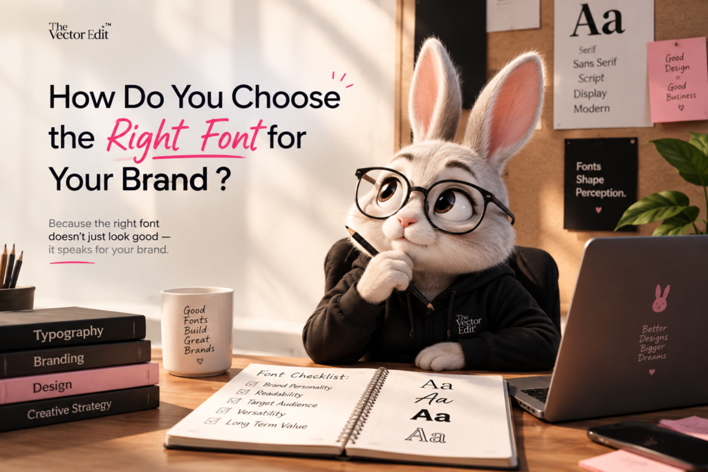
Your font is more than just a style choice — it is part of your brand’s personality.
Think about it: before someone reads what your brand says, they see how it looks. The right typography can make a brand feel premium, modern, playful, bold, trustworthy, or creative. The wrong font can make even a great brand look confusing or unprofessional.
So, how do you choose the right font for your brand?
1. Start With Your Brand Personality
Before choosing a font, understand what your brand wants to communicate.
Ask yourself:
- Is my brand modern or traditional?
- Is it playful or professional?
- Is it luxury or affordable?
- Is it bold or minimal?
- Is it creative or corporate?
For example, a luxury fashion brand might use an elegant serif font, while a modern tech brand may work better with a clean sans-serif font.
Your font should feel like your brand — not just look good.
2. Know Your Font Categories
Understanding basic font categories makes choosing easier.
Serif:
Classic, elegant and trustworthy. Often used by luxury, fashion, editorial and traditional brands.
Sans Serif:
Clean, modern and simple. Popular for technology, startups, digital brands and modern businesses.
Script:
Creative, elegant and expressive. Useful for wedding, beauty, lifestyle and personal brands — but should be used carefully for readability.
Display:
Bold, unique and attention-grabbing. Great for headlines, posters, campaigns and creative branding.
The goal isn’t to find the “prettiest” font. It’s to find the font that communicates the right feeling.
3. Prioritise Readability
A font can look amazing but still be a bad choice if people can’t read it easily.
Always check your font in:
- Website headings
- Body text
- Social media posts
- Buttons
- Mobile screens
- Advertisements
- Printed materials
Especially for body text, choose something clear and comfortable to read.
Good typography should catch attention without making people work to understand your message.
4. Don’t Use Too Many Fonts
More fonts don’t automatically mean better design.
Using too many typefaces can make your brand look inconsistent and messy. A simple combination of two or three fonts is often enough.
For example:
Heading: Bold Display Font
Subheading: Clean Sans Serif
Body: Simple, highly readable Sans Serif
This creates a clear visual hierarchy while keeping your brand consistent.
5. Create a Strong Font Hierarchy
Your audience should immediately understand what to read first, second and third.
Use differences in:
- Font size
- Font weight
- Spacing
- Capitalisation
- Font style
For example:
BIG HEADLINE
Smaller supporting text
Easy-to-read body copy
A strong hierarchy makes your website and social media designs easier to scan.
6. Think About Where Your Font Will Be Used
A font that works beautifully on a logo may not work well for paragraphs.
Think about all the places your brand typography will appear:
- Logo
- Website
- Instagram posts
- Reels
- Advertisements
- Business cards
- Packaging
- Presentations
- Email marketing
Your typography should work across different platforms and screen sizes.
7. Match Typography With Your Visual Identity
Your font shouldn’t exist separately from the rest of your branding.
Consider how it works with your:
Colours + Logo + Photography + Graphics + Layout
For example, a sophisticated colour palette paired with a playful cartoon-style font may create a completely different impression from what your brand intends.
Good branding happens when every visual element speaks the same language.
8. Test Before You Finalise
Never choose a font just by looking at its alphabet.